46: STANDARD ENGLISH CARDS MADE IN CHINA, HONG KONG & TAIWAN
It's been a while since I added a new post to this blog, as I thought it was going to be closed, so I thought I'd restart with a look at some of the many Chinese versions of English cards. This is a very complicated subject, partly because there are so many, some of which are minor, and partly because it's difficult to unravel the relationships between China, Hong Kong and Taiwan and to know just how many card-makers there are.
It will take some time to cover this topic, so think of it as an ongoing post, to which more will be added.
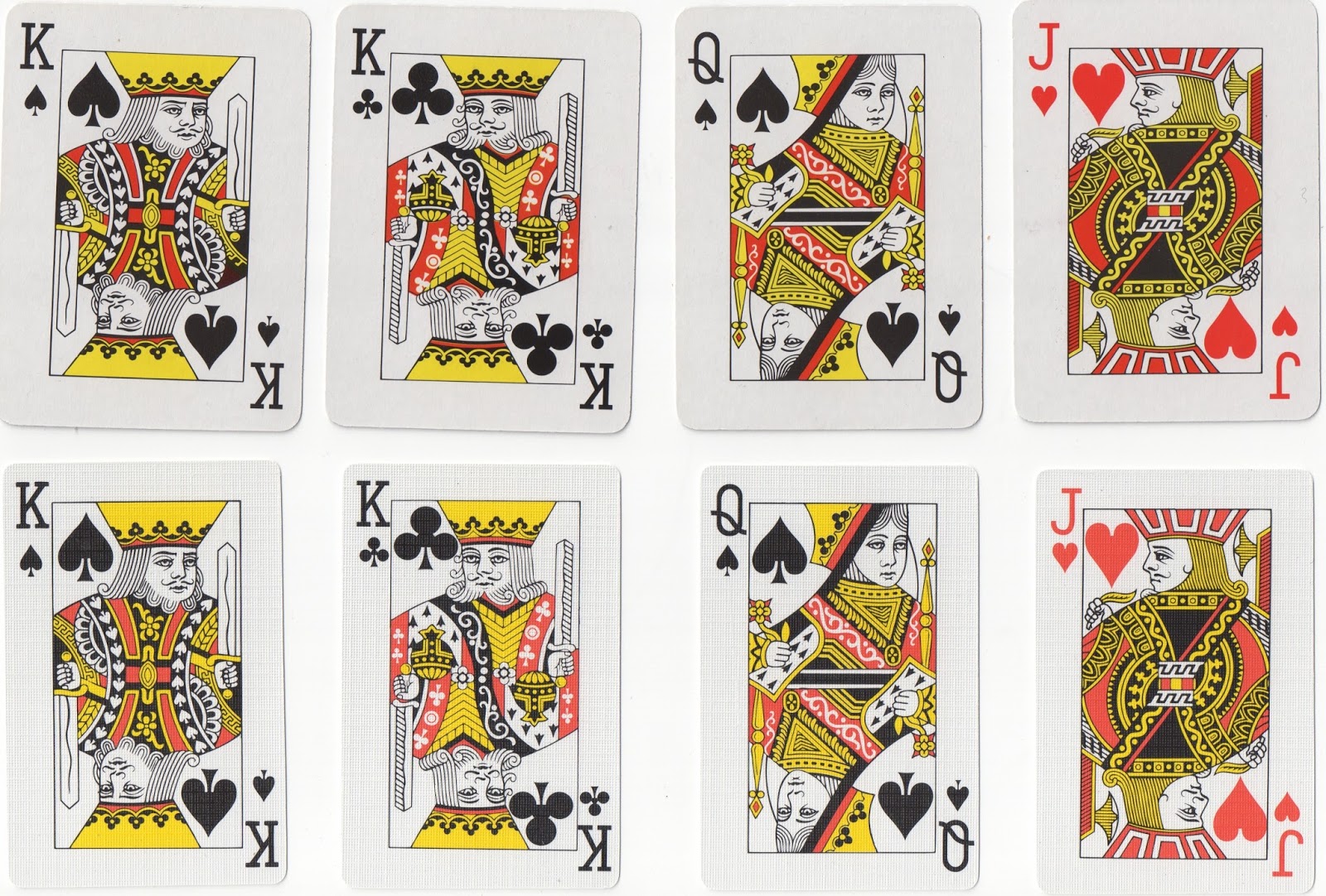
I'll start with the design which is perhaps the commonest by now (though it wasn't to start with), and that is a copy of the USPCC's poker cards, originally designed by NYCCC (US7). Below is an original US7 court set.

US7
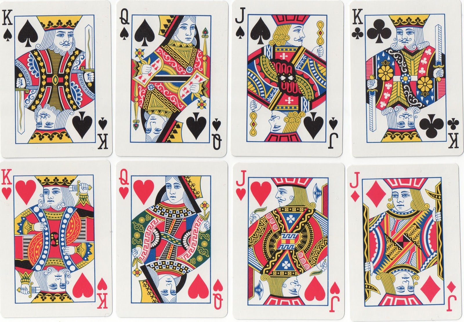
These are sometimes copied extremely closely, so it's the AS, joker or box that tell you it isn't an American pack. The quality of the card is often a give-away as well, but that has changed more recently. But there are also variants with minor differences that indicate a Chinese origin. Three-colour versions are not produced in the US, as far as I know, but they are common in China.

CUS7
Note the small differences: in the bottom row, the top of the QC's sleeve is blue in one case, white in the other, and there is a yellow circle at the centre of the JD on the right. Sometimes colouring is inconsistent and bits get missed out, so the QC in the top row has yellow by her cheek at one end and not at the other.

In the top row above bits of the design of the QD's bodice are missing and so is the curl on the left of the JD's face; in the middle row, the QS's headdress is missing on the right; and the bottom row shows how the poker-sized courts can be squashed by computer manipulation to produce bridge-size cards. Other features to note are the copy of the NYCC Bee AS and the Carta Mundi joker on the middle row, and the odd arrangement of the pips on the bottom 9H.
Two further examples in three colours, showing how the shape of the figures can be compressed or extended for different formats without having to redraw the plates; here a wide pack for Tesco, 2006, and a bridge-size pack.
The original designs have been used as the basis of quite a number of reworkings, which are specific to China/HK/Taiwan and not produced in the US.

CUS7.1
Here the designs have been altered: for example, the QS's bodice has zigzags and curlicues, and there are lines by the JD's pike and he has dots in a panel down the front.
The ASs are also copied from other makers, again with local redesigning in some cases. Below is a selection.

The Bicycle Pinochle AS is in an ordinary 54-card pack, boxed as Eagle 633. (Note that the brand names of Chinese packs often mimic those of American ones.) The Cicada pack even reads "Consolidated-Dougherty". This is clearly a breech of copyright but the Chinese producers may not even be aware of the relevance of the name of a firm that no longer exists. The AS and AH belong with the second of the CUS7.1 courts above; they are from a pack for the Italian market and are on good quality card (1997). Whether they were printed in China is not clear, but the plates look the same as in the other examples, only they have been slightly reduced. The indices are typically Italian.
A considerable redrawing is seen on CUS7.2, originally used in British Hong Kong in the late 1960s and early 70s in the pack with pale colours and multi-coloured pips. The QS now has a target on her bodice and the JD three diamonds at the centre.


CUS7.2

CUS7.3
In CUS7.3 the JS holds a small paddle, the JC a wand with two spherical ends, and the hook ono the JD's pike is angled. The top example is from a pack advertising phone cards: the right-hand image is the back design, but the kings are all of this design for this pack without the legends and with the appropriate suit-signs. The bottom one is a bridge pack in three colours: the corner pips are upside-down on the KH and QH! c.2000-2005.
CUS7.4
A rather elegant version with more alterations: the QS has a Greek key design on her bodice, the KC's orb has a flower design on it and the KH has circles down the edge of his cloak. From the 1990s.

Top: CUS7.5
Bottom: CUS7.6
CUS7.5 has a JS holding a sword, no feather on the JC's cap and the Taiwanese K on the JH's chest. This three-colour pack was imported from Taiwan by the English firm Tobar (now out of business) c.2004. CUS7.6 is a widely used version with a distinctive fan design at the centre of the JS and a black and white pattern at the centre of the JD. These courts are also found in bridge-size packs with various frame sizes. It was used originally in British Hong Kong and goes back to at least 1980; it is still in use.
The next three types move further away from the original, but are still recognizable as being related.

CUS7.7
CUS7.7 has turned back all the turned courts to give the traditional postures in each case. In this example the sides of the design have been cut down, so, for example, the jacks' halberds and pikes have no upright staffs. The pack was made in Hong Kong, c.1990.

CUS7.8
CUS7.8 has been redrawn in an angular style with considerable alteration to the clothing. These packs are called Vegas and were also made with jumbo indices; they were made in China for America in 2003. The quality of the card is very good indeed.

CUS7.9
Sometimes I suspect that court designs are a one-off for a particular order. I have so far only seen CUS7.9 in a pack called Celtic (see back design) made in China in c.2005. All the queens and jacks are turned from their positions in US7, resulting in a left-facing JS and a ¾ right-facing QH.
There is also a redrawing of CUS7 with some details of the clothing changed. This should perhaps be given a separate classification number.

The top row shows variation on the clothing, such as yellow spades on the QS's bodice, circles at the centre of the JS and ermine on the JC's cloak edge. The bottom row is a bridge-size version with unusual colour distribution, especially the blue on the JD. The yellow has been overprinted on blue on the KD's roundels, giving a green colour. From c.2010.
Well, this is a start. There'll be more pages to come dealing with different designs.
posted by Ken Lodge @ 10:31
0 Comments
![]()
